Tuesday 16 December 2014

Feedback for Digipak and Poster

Friday's lesson as a whole class we had a feedback session for 2 hours on each others Digipak's and the Posters to go with it, that we had so far.

I had a near enough finished first draft of my digipak and a simple designed poster that I was not sure to begin with was what I really wanted it to look like, because of deadlines needing to be made. I explained my concept to my fellow students and teacher Sinead of my reasons for the design of the digipak, overall the feedback was positive with constructive feedback for my work. The feedback I felt gave me new ideas to explore and to change a few things in general. However one of the most repeated comments on my Digipak was that the pictures work but i had no background scenery pictures that i had to contrast from the simple photo shoot style pictures of Isabel.

From all the feedback and support I was given I then began to think of new ways to increase the appeal to my digipak and what new photos I could take for it to be more eye catching and less simple pictures. I have an idea to go to Danson Park, were we first took the original digipak photos of myself, however i would use the woodlands area of the park for the shoot. I wanted also for Poppy to wear a costume of a black jacket to relate to the black top she wore for the previous set of photos, so it would make a connection through the colour black. I am going to test out this idea and then expand from this on a new digipak and poster based around it for the next deadline. 

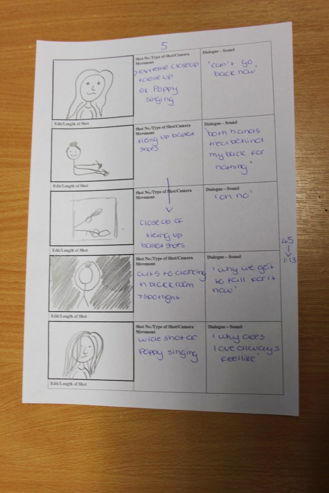
Here are a few of the feedback sheets I got back after the session on Friday:

New Storyboard

We wanted to as a group redo the storyboard for the music video, so the frames are more a clearer showing on what should/will be included and this will support a easier understanding of the music video in general.

In addition when we first begun to redo the storyboard the main feature we wanted to change was the illustratiosn for the visual  that were produced for each frame of the music video. They were not clear and defined enough, so when the drawings for the new storyboard were drawn, we applied these requirements to them. Also this was taken upon to be applied to the cinematography and sound parts of the storyboard, were by more detail and simple statements were made for each shot.
    After when looking at the original and now new storyboard you can clearly see the higher level of time has been taken with the new one, I also believe someone who had no idea what we was doing for our music video would also have  a basic idea of what is going on.


Monday 15 December 2014

Poster - Digipak

This is the first draft of my poster that links to my digipak, I kept the same pink and white theme for the poster swell. I used a new image of the artist for the poster but it relates because she has the same outfit on and was from the same shoot. I kept the typography also the same from the digipak so there was still a noticeable look between the two, I also added the album cover of the digipak into the poster to make the connection more obvious because she is a new artist.


When looking again at other posters for other female Pop artists albums such as: Rihanna and Pixie Lott. These two posters have influenced my poster design such as were the text is placed on the poster and what information is included. 

Second Draft of Digipak

This is a few images of my first experiments of my first digipak draft with the new pictures we took of Poppy for our artist, Isabel Beau. 

I have aimed for the theme for the digipak to be pink and black to keep with the Pop genre conventions of a female being related to the colour pink. Also the images are mostly close ups and mid shots which are included on 4 panels of the digipak. I decided to use two sets of photo shots combined into this one digipak to see show her outfits and her with make up and no make up. I believe that this works well with the two outfits which is stereotypical for a female Pop artist to be fashionable. Furthermore the typography from, 'Da Font' for the artist name and the album title i downloaded on to photoshop and used it, 'Roboto' and 'DaddysGirl'. 
I decided to add pink and black glitter into the digipak to make it more appealing and fit with the Pop genre conventions, i used the pink glitter for the album CD and the black glitter for the bonus CD cover. Also this co-ordinates with the colour of the typography for the album. I decided to add social media links on to the back cover of the album and a website link for Isabel Beau, this is so she can connect with her fans and people can get to know her because she is a young Pop artist. 

In addition I added black and pink glitter to the background of the CDs and switched them over to keep the co-ordination going on between the two colours. I changed the light pink typography to dark pink so it would stand out against the panel pictures more clearly. Throughout the digipak creation process I struggled to decided on the spine colour I begun with pink glitter, however I finally went with the choice of black glitter for the spine. I changed the album name, 'Uncovered' from black to white, so this would be more striking on against the black glitter and would make it able to work. 
      

Thursday 4 December 2014

2nd pitch presentation


In Wednesday's lesson me and Aaron presented our new pitch that we all created as group since the feedback and constructive criticism feedback given from the previous pitch we had given to our fellow classmates and teacher Sean.  

This is our pitch presentation that we presented and it was also recorded.

Friday 28 November 2014

My Own Photo Shoot

For my photography I am doing my current unit on portraiture, I believe some of the portraits i took would work well for my digipak. The photos are still in a studio set with the white backdrop, however the costume and the make up are different showing a more vast range of looks of her. Also this abides by the Pop genre conventions of the record label wanting the artist to be clearly seen and of what they look like. 

Furthermore I believe the natural make up in these photos work better so I don't have to edit her skin to much like the other photo shoot photos. I am going to use 2 photos from my original photo shoot with her and then 2 photos from this shoot. Also I think these pictures show her innocent and young side more showing her personality clearly to her fans and the public. Where as the other photos with the white lace top showing her in a sexual light, voyeurism to appeal to a male audience. 

Friday 21 November 2014

Change of the Narrative

After are group pitch we noticed from the feedback and our own personal opinions that are narrative might be to complicated. We came to this decision after thinking about the little girl growing up to her older self we need two ballet dancers who look similar and can shoot on the same day.

We are still going to keep my little sister, Grace as the ballet dancer in the music video, however we are going to use our artist Isabel beau played by Poppy in the video more. The new narrative is going to be Grace's story which will be  the same, but Isabel Beau's early life experience of what she went through as a young girl and now she is singing about it in the present. Also Grace dancing will be in black and white to show that is the past and Isabel Beau(Poppy) singing will be in colour to show the difference between the past and present.  In addition we are going to have their hair style name so the viewer can see an obvious connection between the dancer and the artist. 

3rd Photo Shoot

After school on Tuesday we did a 3rd digipak shoot to get some new images for our digipaks. We decided to do a reshoot because they previous shoot the costume which was all black clothing did not convey the Pop genre as clearly as we would of wanted.With this in mind we asked Poppy on the group chat to wear: a white lace crop top,burgundy leather skirt and have her hair styled wavy. Her fashionable style would connect and relate to her target audience of young females between the age of 12-25 year olds, they will look up to her for her fashion trends. 

 I was the photographer for the photo shoot, I had to direct Poppy where to move and make sure the quality of the images were good. Laxmi was the make up artist and she focused on pink make up to fit with the Pop genre of connotations of pink being: happiness,love and girly.  Aaron set up the shoot which include, the white backdrop,2 lights and a DSLR camera. He also researched while we were shooting Pop artist digipaks for certain shots of Poppy, such as: Pixie Lott and Taylor Swift.  Hayley and Laxmi both helped Poppy to pose and what they could see what was working and what wasn't. 

These are some of my favourite images from shoot that i will be using in my digipak: 


First Draft of Digipak

This is my first draft of my digipak, it is a basic digipak with just the pictures included. These pictures are from the first test shoot we did for our digiapk before we changed our artist. I selected my favourite images that I believe had the best quality and fitted the Pop genre the best, I then added this to a internet template of a digipak. 

With this digipak draft I wanted to see if I wanted my digipak to be either in colour or in black & white. This is because one of our main influences Pixie Lott has one of her albums in black & white, but in general pop albums are usual are in bight colours. I wanted to make some link to our music video because this can be seen in albums such as Rihanna's 'Loud' which has a similar design to her song released from the album, 'Only girl in the world'. With all this in mind looking at this digipak i will most likely just have the album all in colour to connect more to the Pop genre and appeal to the target audience so it stands out and attracts the young female audience more. 

In addition I am not going to use any of these images in my final digipak design because of us changing our artist. However but from creating this has helped me know what type of poses and shots I want to be included on my digiapk. Also when I take the photos I can be more refined and specific with the shoot.

Wednesday 19 November 2014

Feedback for Pitch

We got mixed feedback from our pitch presentation last Wednesday but the majority was positive. Some of the positive feedback back was about:
  • the video has potential
  • who the artist is
  • use of terminology
However we also had some constructive criticism on our pitch but we took this positively and now believe as a group we can build on this and focus on certain parts to improve them as much as we can. The bad points were made about:
  • the narrative being slightly confusing
  • no storyboard or mood board ( even though we had them finished - forgot to use them)
  • no animatic
  • what the artist look liked
These are a few of the feedback sheets our fellow classmates and our teacher Sean filled out during our pitch and what we are using to improve our artist and music video.


Tuesday 18 November 2014

New Artist Digipak Photo Shoot


Friday after school we planned a digipak shoot after school to get some photos of our new artist who is modelled by Poppy. We need to get some basic pictures to show who are artist is in our audience profile and some ones to include on our digipaks. I believe some good shots were taken, however the costume for the shoot us as a group believed didn't not amplify the Pop genre that we wanted. This is due to the costume being mostly black and black connotes dark and evil feelings which would fit with more a more Indie artist than Pop.

We came up with two options to recertify this the first being, to edit the clothes in Photoshop to bright colours such as pink etc. Also we have now planned another photo shoot to do in the gallery to get some more simple background shots for the digipak. This will be alongside the digipak photos we are going to take in Greenwich. 

Sunday 16 November 2014

Typography for Album


As a group we began to look and think about the typography for the title of the album, 'Uncovered'.  When first looking at other Pop album's from female artists we found they mostly all had simple and non fancy font for their album titles.This was also supported by our own personal research into digipak analysis at the start of the project. We all believed that by using a simple and basic font for the cover it would amplify the focus of the artist which is a genre characteristic of the Pop. 

To start off the research for the album title typography we used the online website, 'DaFont' again which we had previously used for the typography of the artists name. We chose a range of simple and sophisticated types of font and end up choosing 7 different types. We also asked a sample of fellow media students to chose their favourite aswell us individuals in the group. From this doing chart and answering it in a tally we found that a certain font in particular was the most popular out of all the rest.

We concluded that, Roboto was the most popular and would fit in best with the Pop genre characteristics for our digipak. Me and Hayley decided to stick with this font for our digiapaks, however Laxmi and Aaron decided to go with, Futurist fixed-width for the digipak design. This makes no difference to our digipaks because they are all individual.


Also when thinking about digipaks I had a design idea that would make the album title stand out a bit more by having a capital, 'U' and 'C' - UnCovered, and Laxmi tried this idea on DaFont and we all decided it did not fit in very well once it had been made. So with that idea seen and it didnt feel right to us that it would present our artist perfectly we disregarded this idea.


Online Chat with Poppy - New Artist

Once we had changed the artist for Isabel Beau I began sharing information and talking with Poppy on a group chat on Facebook so we could easily communicate on behalf of my group. We spoke about certain topics such as:planning the digipak photoshoots, costume and general conversation about what kind of Pop artist she would be portraying.

I believe by having this easily accessible chat with Poppy outside of 6th form hours has really benefited our group because when we get new ideas we need to share with Poppy. This means,instead of trying to locate her in school I cam just message her at any time so both of us are updated and know what is going on.  Looking forward I am going to create a bigger group chat with all members of the group and Poppy so we can all chat and share ideas.

Presentation and Recording for Pitch


This was our final presentation as group we had made to present to our fellow classmates and teacher Sean for our artist, Isabel Beau and the music video for the song, 'Battlefield'. This presentation has no included information as for the presentation we individual scripts to read from for the audience to listen to, this was so they could relate it to the visuals on the screen.

Wednesday 12 November 2014

New Location/Reshoot for Digipak

When looking to do a shoot for our digipak at Notting Hill we didn't really have any idea how to get there or how long it would take. After researching where about specifically it was we found it out it would take us over an hour and a half away from where we all live in Welling. It would be awkward travelling with the tripod and paying for travel for Poppy to come along with us to do the shoot, we found from our teacher that in Blackheath which is 20 minutes maximum away there are pastel coloured houses there also. 

We have made a final decision to do a photo shoot for our digipak at Blackheath, Dacre Park in the next coming weeks so we can also begin to create our digipak. This also has various coloured houses but not as many as Notting Hill, however there are more benefits to shooting here, such as : travelling and accessibility. With it only being 20 minutes away from where we all live it is a perfect location to use for our digipak. I believe with the right day scheduled where there will be bright sun and no dark sky we can get some really high quality and interesting photos. 

These are some street view screenshots of, Dacre Park where we are going to set up our shoot for our digipak. Also if these photos don't turn out the way we want them to with have a last option location which is in Greenwich.