
Monday, 5 January 2015
NEW POSTER
With the poster I used a new picture of Isabel (the artist) to design the poster around. I kept the typography also again with the pink and white theme for the digipak and the roughly same layout for it as well on the new poster. Also the new typography, 'Piedrita' works better for the Pop Genre look I am going for . In addition I have still included the album front cover on the poster as well to create the connection between the two of them.

NEW DIGIPAK
I began by recreating my digipak by uploading my front cover image of the artist as this is still my favourtie on to the digpak template, this was a starting point for me. Also i found one other blank white wall photo shoot portrait of the artist to use as an extra panel image that fits in well. The struggle I had was finding 2 pictures that i wanted and would work within the digipak that were from the woodland shot, however i found 2 that I believe are beautiful shots and amplify the genre not as obvious as the first digipak but more low key and less in your face. The pictures still show innocence because she is a young artist but they also have a sex appeal because of her facial expressions she is pulling. Furthermore you could relate the digipak of the autumn theme with the soft pink colours to the Pop genre.
In additon I personally liked the extra social media links and the setting out of all the typography so i kept the layout of it the same but i wanted a new font. In addition I had used, 'Da Font' for my previous text for the artist and the album title etc, but I wanted something my delicate and girly, I found one called 'Piedrita'. I believe this really works well with my theme for the digipak and i kept the colour pink and white scheme for the typography as same as the original.
The 2 CDs for the album have been similiary designed to the original digipak with the CD having the autumn leaves on it then that being the background for the bonus disc and the same again etc. I believe that the autumn leaves works with the leaves in the backgroudn of the 2 woodland shots with the artist in.I have yet still to make a lyric booklet but i have the front cover of it on the digipak with Isabel's face but i know I am going to have the pink watercolour background with the lyrics in white writing over it in the same font as the rest of the digipak.

Tuesday, 16 December 2014
Feedback for Digipak and Poster
 Friday's lesson as a whole class we had a feedback session for 2 hours on each others Digipak's and the Posters to go with it, that we had so far.
 I had a near enough finished first draft of my digipak and a simple designed poster that I was not sure to begin with was what I really wanted it to look like, because of deadlines needing to be made. I explained my concept to my fellow students and teacher Sinead of my reasons for the design of the digipak, overall the feedback was positive with constructive feedback for my work. The feedback I felt gave me new ideas to explore and to change a few things in general. However one of the most repeated comments on my Digipak was that the pictures work but i had no background scenery pictures that i had to contrast from the simple photo shoot style pictures of Isabel.

From all the feedback and support I was given I then began to think of new ways to increase the appeal to my digipak and what new photos I could take for it to be more eye catching and less simple pictures. I have an idea to go to Danson Park, were we first took the original digipak photos of myself, however i would use the woodlands area of the park for the shoot. I wanted also for Poppy to wear a costume of a black jacket to relate to the black top she wore for the previous set of photos, so it would make a connection through the colour black. I am going to test out this idea and then expand from this on a new digipak and poster based around it for the next deadline.
Here are a few of the feedback sheets I got back after the session on Friday:


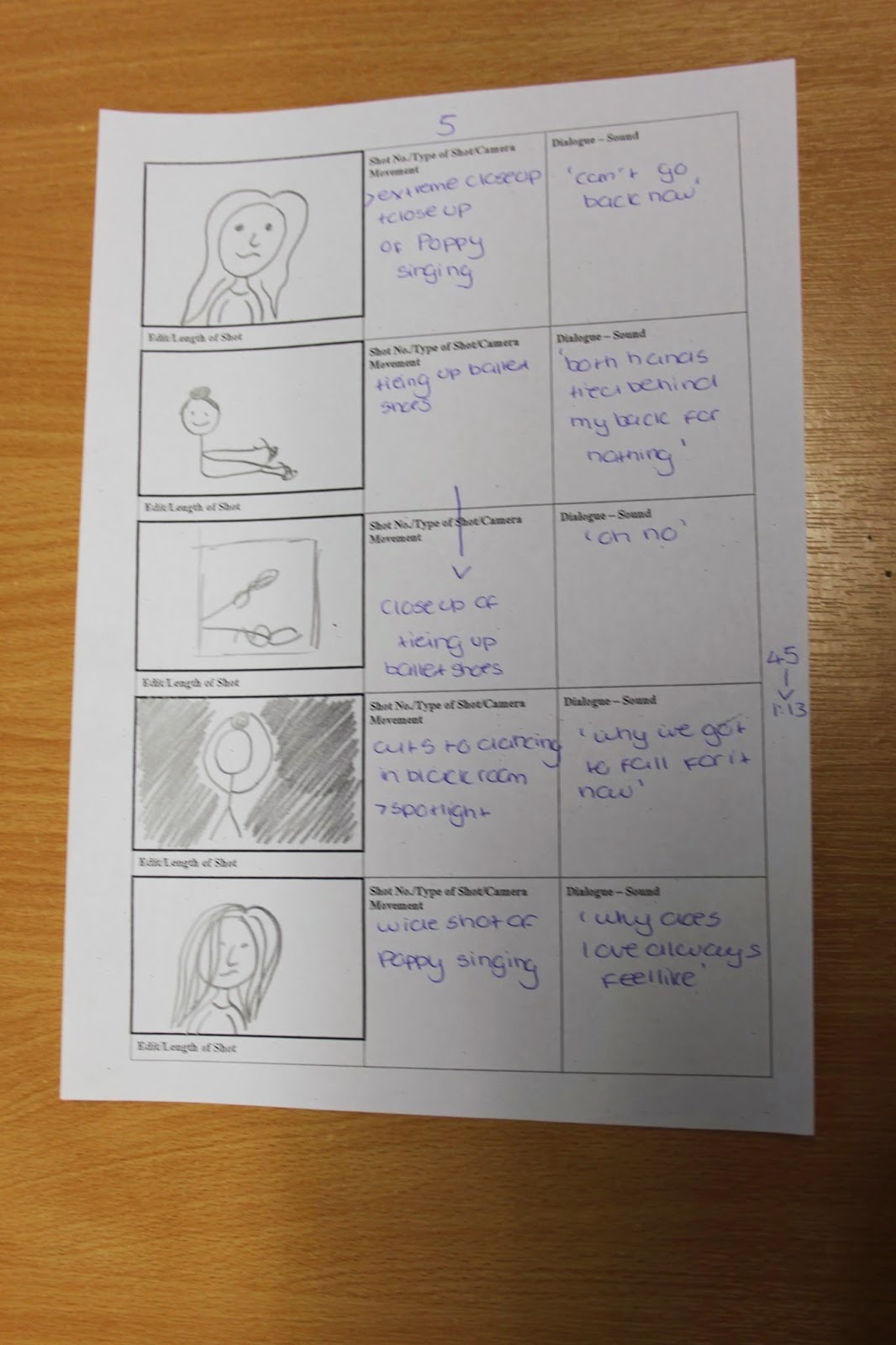
New Storyboard
 We wanted to as a group redo the storyboard for the music video, so the frames are more a clearer showing on what should/will be included and this will support a easier understanding of the music video in general.
In addition when we first begun to redo the storyboard the main feature we wanted to change was the illustratiosn for the visual that were produced for each frame of the music video. They were not clear and defined enough, so when the drawings for the new storyboard were drawn, we applied these requirements to them. Also this was taken upon to be applied to the cinematography and sound parts of the storyboard, were by more detail and simple statements were made for each shot.
After when looking at the original and now new storyboard you can clearly see the higher level of time has been taken with the new one, I also believe someone who had no idea what we was doing for our music video would also have a basic idea of what is going on.



Monday, 15 December 2014
Poster - Digipak
This is the first draft of my poster that links to my digipak, I kept the same pink and white theme for the poster swell. I used a new image of the artist for the poster but it relates because she has the same outfit on and was from the same shoot. I kept the typography also the same from the digipak so there was still a noticeable look between the two, I also added the album cover of the digipak into the poster to make the connection more obvious because she is a new artist.


When looking again at other posters for other female Pop artists albums such as: Rihanna and Pixie Lott. These two posters have influenced my poster design such as were the text is placed on the poster and what information is included.
Second Draft of Digipak
This is a few images of my first experiments of my first digipak draft with the new pictures we took of Poppy for our artist, Isabel Beau.
 I have aimed for the theme for the digipak to be pink and black to keep with the Pop genre conventions of a female being related to the colour pink. Also the images are mostly close ups and mid shots which are included on 4 panels of the digipak. I decided to use two sets of photo shots combined into this one digipak to see show her outfits and her with make up and no make up. I believe that this works well with the two outfits which is stereotypical for a female Pop artist to be fashionable. Furthermore the typography from, 'Da Font' for the artist name and the album title i downloaded on to photoshop and used it, 'Roboto' and 'DaddysGirl'.


I have aimed for the theme for the digipak to be pink and black to keep with the Pop genre conventions of a female being related to the colour pink. Also the images are mostly close ups and mid shots which are included on 4 panels of the digipak. I decided to use two sets of photo shots combined into this one digipak to see show her outfits and her with make up and no make up. I believe that this works well with the two outfits which is stereotypical for a female Pop artist to be fashionable. Furthermore the typography from, 'Da Font' for the artist name and the album title i downloaded on to photoshop and used it, 'Roboto' and 'DaddysGirl'.
I decided to add pink and black glitter into the digipak to make it more appealing and fit with the Pop genre conventions, i used the pink glitter for the album CD and the black glitter for the bonus CD cover. Also this co-ordinates with the colour of the typography for the album. I decided to add social media links on to the back cover of the album and a website link for Isabel Beau, this is so she can connect with her fans and people can get to know her because she is a young Pop artist.
In addition I added black and pink glitter to the background of the CDs and switched them over to keep the co-ordination going on between the two colours. I changed the light pink typography to dark pink so it would stand out against the panel pictures more clearly. Throughout the digipak creation process I struggled to decided on the spine colour I begun with pink glitter, however I finally went with the choice of black glitter for the spine. I changed the album name, 'Uncovered' from black to white, so this would be more striking on against the black glitter and would make it able to work.
Thursday, 4 December 2014
2nd pitch presentation
In Wednesday's lesson me and Aaron presented our new pitch that we all created as group since the feedback and constructive criticism feedback given from the previous pitch we had given to our fellow classmates and teacher Sean.
This is our pitch presentation that we presented and it was also recorded.
Subscribe to:
Posts (Atom)