
This is my final poster

 Friday's lesson as a whole class we had a feedback session for 2 hours on each others Digipak's and the Posters to go with it, that we had so far.


 I have aimed for the theme for the digipak to be pink and black to keep with the Pop genre conventions of a female being related to the colour pink. Also the images are mostly close ups and mid shots which are included on 4 panels of the digipak. I decided to use two sets of photo shots combined into this one digipak to see show her outfits and her with make up and no make up. I believe that this works well with the two outfits which is stereotypical for a female Pop artist to be fashionable. Furthermore the typography from, 'Da Font' for the artist name and the album title i downloaded on to photoshop and used it, 'Roboto' and 'DaddysGirl'.

 For my photography I am doing my current unit on portraiture, I believe some of the portraits i took would work well for my digipak. The photos are still in a studio set with the white backdrop, however the costume and the make up are different showing a more vast range of looks of her. Also this abides by the Pop genre conventions of the record label wanting the artist to be clearly seen and of what they look like.


 After school on Tuesday we did a 3rd digipak shoot to get some new images for our digipaks. We decided to do a reshoot because they previous shoot the costume which was all black clothing did not convey the Pop genre as clearly as we would of wanted.With this in mind we asked Poppy on the group chat to wear: a white lace crop top,burgundy leather skirt and have her hair styled wavy. Her fashionable style would connect and relate to her target audience of young females between the age of 12-25 year olds, they will look up to her for her fashion trends.



 With this digipak draft I wanted to see if I wanted my digipak to be either in colour or in black & white. This is because one of our main influences Pixie Lott has one of her albums in black & white, but in general pop albums are usual are in bight colours. I wanted to make some link to our music video because this can be seen in albums such as Rihanna's 'Loud' which has a similar design to her song released from the album, 'Only girl in the world'. With all this in mind looking at this digipak i will most likely just have the album all in colour to connect more to the Pop genre and appeal to the target audience so it stands out and attracts the young female audience more.
 Friday after school we planned a digipak shoot after school to get some photos of our new artist who is modelled by Poppy. We need to get some basic pictures to show who are artist is in our audience profile and some ones to include on our digipaks. I believe some good shots were taken, however the costume for the shoot us as a group believed didn't not amplify the Pop genre that we wanted. This is due to the costume being mostly black and black connotes dark and evil feelings which would fit with more a more Indie artist than Pop.
 We came up with two options to recertify this the first being, to edit the clothes in Photoshop to bright colours such as pink etc. Also we have now planned another photo shoot to do in the gallery to get some more simple background shots for the digipak. This will be alongside the digipak photos we are going to take in Greenwich.
 As a group we began to look and think about the typography for the title of the album, 'Uncovered'. When first looking at other Pop album's from female artists we found they mostly all had simple and non fancy font for their album titles.This was also supported by our own personal research into digipak analysis at the start of the project. We all believed that by using a simple and basic font for the cover it would amplify the focus of the artist which is a genre characteristic of the Pop.
 To start off the research for the album title typography we used the online website, 'DaFont' again which we had previously used for the typography of the artists name. We chose a range of simple and sophisticated types of font and end up choosing 7 different types. We also asked a sample of fellow media students to chose their favourite aswell us individuals in the group. From this doing chart and answering it in a tally we found that a certain font in particular was the most popular out of all the rest.


 We have made a final decision to do a photo shoot for our digipak at Blackheath, Dacre Park in the next coming weeks so we can also begin to create our digipak. This also has various coloured houses but not as many as Notting Hill, however there are more benefits to shooting here, such as : travelling and accessibility. With it only being 20 minutes away from where we all live it is a perfect location to use for our digipak. I believe with the right day scheduled where there will be bright sun and no dark sky we can get some really high quality and interesting photos.
  When we was at Danson Park doing the shoot for the Digipak we was talking about the photos and me being the artist for the music video as well. We all agreed that we wanted to amplify the Pop feel and look more in our photos with a new artist and I strongly agreed with this because I also want to have more involvement behind the camera.


 Below are some of my favourite images from the shot:


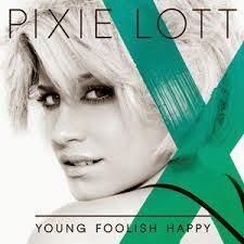
 For my digipak when thinking out how i am going to create it, i have been influenced by, Pixie Lott's front cover image.It is a extreme close up of her face showing emotion which i want my digipak to amplify because of the music video being an showing emotion and the album is about Isabel's story . In addition the black and white edit of the image of Pixie is also how i want to edit my front cover image to also relate to the music video, however i am not going to relate it ballet. Also the use of colour in Pixie's album cover is done by a cross going in turquoise going across it, where as i am going to our artist name in colour, at the moment the colour i think will be pink to keep with the girly theme that is a genre convention of Pop. I want to shoot these extreme close up shots in a studio style room such as the gallery we have in our school building which is all white walls.
 Furthermore i am also going to include inside the digipak on one panel is a wide shot of the artist standing in front of a row of multicoloured pastel houses which are located in Notting Hill we are going to set up a shoot there also. I will keep this image in colour to add a more fun and young feel to the digipak inside to also abide to the genre conventions of Pop, which will appeal to Isabel's target audience of 12-25 year olds. Also there will be 2 CDs within the digipak, one of these will be the album CD which will include all the tracks from the album and also the other will be a 'Day in the Life of Isabel Beau'. This is so her fans can get a real life personal one to one view of her life which will appeal to her young target audience, so she can connect with her fans more. The CDs i want to be plain white with light pink typography to relate to the pink typography on the album cover , they will have on them her name and the album title.


 It is a type of packaging for CDs or DVDs, they are usually made from cardboard with one or more plastic trays which are capable of holding a CD that is attached inside.


