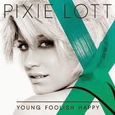
 As a group we began to look and think about the typography for the title of the album, 'Uncovered'. When first looking at other Pop album's from female artists we found they mostly all had simple and non fancy font for their album titles.This was also supported by our own personal research into digipak analysis at the start of the project. We all believed that by using a simple and basic font for the cover it would amplify the focus of the artist which is a genre characteristic of the Pop.
 To start off the research for the album title typography we used the online website, 'DaFont' again which we had previously used for the typography of the artists name. We chose a range of simple and sophisticated types of font and end up choosing 7 different types. We also asked a sample of fellow media students to chose their favourite aswell us individuals in the group. From this doing chart and answering it in a tally we found that a certain font in particular was the most popular out of all the rest.
We concluded that, Roboto was the most popular and would fit in best with the Pop genre characteristics for our digipak. Me and Hayley decided to stick with this font for our digiapaks, however Laxmi and Aaron decided to go with, Futurist fixed-width for the digipak design. This makes no difference to our digipaks because they are all individual.

Also when thinking about digipaks I had a design idea that would make the album title stand out a bit more by having a capital, 'U' and 'C' - UnCovered, and Laxmi tried this idea on DaFont and we all decided it did not fit in very well once it had been made. So with that idea seen and it didnt feel right to us that it would present our artist perfectly we disregarded this idea.


No comments:
Post a Comment